Isle of Skye Distillers
Building an authentic Isle of Skye spirits brand from the ground up through packaging, digital, social and storytelling.
Overview
Two Isle of Skye locals approached us with an idea to create a gin, using their knowledge of distilling and local foraging to ensure every ingredient and process happened entirely on Skye. Together we built Isle of Skye Distillers from the ground up, developing the identity, packaging, website, social presence and overall visual direction for Misty Isle Gin and later Tommy’s Gin. Today the distillery has grown into one of the more recognisable independent gin brands in Scotland.

Challenge
The challenge was to create a distinctive and authentic brand within a saturated gin market. Research showed that many Scottish gins are produced outside Scotland and only bottled locally, highlighting a gap in genuinely authentic Scottish brands. We wanted to focus on the real story behind the distillery, showing the owners making the gin themselves, foraging local ingredients and hand labelling bottles on the island to create a brand rooted completely in Skye provenance.


Design process
The concept centred around the landscape, heritage and spirit of Skye. Every part of the identity was designed to reinforce authenticity, from the rugged visual style and natural colour palette to photography focused on the owners, the island and the production process. Messaging consistently highlighted local ingredients, island made production and the personal story behind the distillery, helping the brand feel genuine and connected to place across packaging, web and social media.
Final result
The project developed into far more than a bottle design, becoming a full brand system applied across packaging, merchandise, social media, campaigns and digital platforms. The website also acted as a hub for Skye itself, featuring local storytelling and an interactive stockist map that helped customers discover where to buy the gin, something that was relatively uncommon at the time and later adopted more widely across the industry.


The bottle
The bottle was designed to feel heavy, bold and rugged, reflecting the landscape of Skye itself. The neck shape was inspired by the Old Man of Storr, creating a recognisable silhouette that tied directly back to the island. Embossing, textured finishes and metallic foils helped elevate the bottle, giving it a premium feel while still retaining its raw and authentic character.


Photoshoot
We travelled across Skye with a photographer to capture the bottle within the island’s dramatic landscape. The photography focused on natural lighting, moody textures and rugged scenery to reinforce the atmosphere of the brand and create authentic imagery for use across the website, campaigns and promotional material.


Tommy's Gin
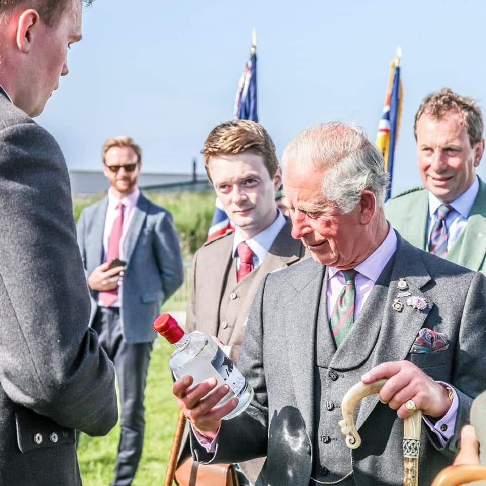
Tommy’s Gin was created as a tribute to the founders’ late father and his connection to the British Army, with part of every sale supporting veteran charities. The design took a more commemorative approach, combining military inspired colours, collage artwork and a hand dipped red wax seal inspired by the poppy to create a product that felt personal, respectful and distinctive within the wider range.

Awards
Since launch, the range has received international recognition through the IWSC, World Gin Awards, World Vodka Awards and London Spirits Competition, including multiple Gold awards and the IWSC Vodka Trophy.